You might be noticing a few changes to the way we look and wondering - what’s happening?

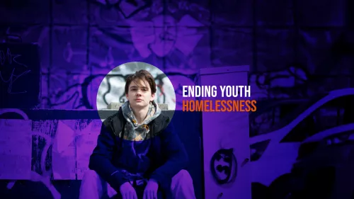
Back in 2021 we launched our Change the Story strategy where we shared our commitment to ending youth homelessness. When we did this we undertook some research on how people felt about Centrepoint and the overwhelming feedback was that our look didn’t match our ambition.
We did a lot more research with both our brand agency, Spencer duBois, and our web agency, Fat Beehive as well as testing with our supporters, the wider public and, importantly, with the young people we support and who we hope to reach and developed our new look.
You’ll notice our logo has changed slightly but our iconic orange Centrepoint is still there and within our new look there’s also some references back to our old logos of the 1970s and 1980s.

When Centrepoint was founded in 1969 it was because the Reverend Kenneth Leech looked at the young people sleeping on the streets of Soho, London and felt he had to do something.
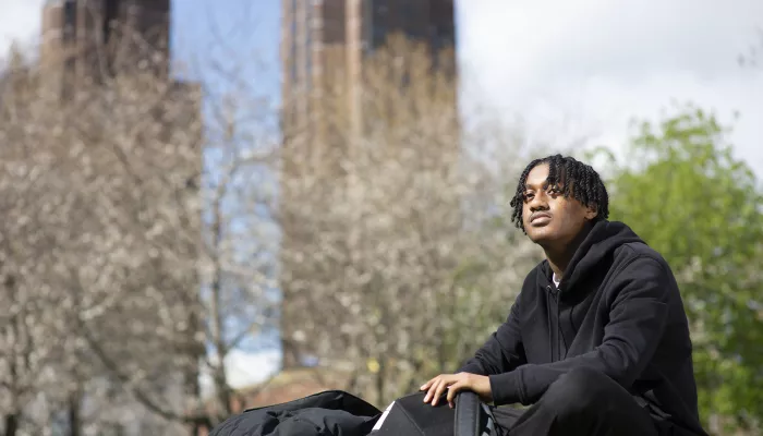
He opened up the basement of his church as a night shelter for young people. He chose the name Centrepoint because the Centre Point tower loomed empty over Soho and he felt this was an ‘affront to the homeless’.
More than fifty years on, we’re still here, we’re still providing support and safe places for young people to rebuild their lives.
The way we do things has changed a lot since 1969 and so have the young people we support but we’re still true to where we started. That’s what our new look represents and our commitment to ending youth homelessness.
This won't be a huge immediate change. We want our new look to help us make an impact - but we also want to make sure we continue to use our resources effectively. So, you may see some of our new look alongside our existing look, it’s all still us. Still Centrepoint.

